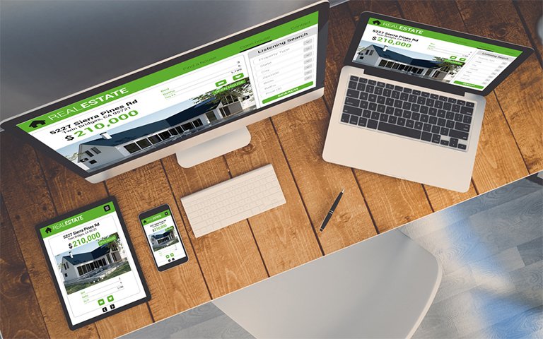
Responsive Web design is not just a trend anymore—it’s a basic need for every modern website. With users accessing websites through smartphones, tablets, desktops, and even TVs, building a layout that works well across all these devices is essential. Below are useful tips, practical tricks, and tested best practices that help web designers and developers build responsive websites that perform well, look professional, and offer a better user experience.

Start with Mobile First
Begin designing your website from the smallest screen size and scale up. This approach ensures that the core content and essential functions are loaded and accessible without overwhelming small screens. Once the design works well on mobile, you can add more advanced features and layouts for larger screens like tablets and desktops.
Use Flexible Grids Instead of Fixed Layouts
Instead of setting widths using pixels, define them in percentages. This allows your layout to adapt based on screen size. CSS Grid and Flexbox are powerful tools that help in building flexible and organized layouts. Avoid rigid templates that fail on smaller devices.
Apply Proper Media Queries
Media queries allow your site to detect screen size and apply styles accordingly. Define breakpoints for common screen widths such as:
- 320px – Small devices (phones)
- 768px – Medium devices (tablets)
- 1024px – Large devices (desktops)
Make sure to test your design at each breakpoint.
Make Images Responsive
Use img { max-width: 100%; height: auto; } in your CSS. This ensures that images resize with the container, preventing overflow and broken designs. Additionally, serve modern image formats like WebP for faster load times.
Avoid Using Photoshop-Only Designs
Instead of relying entirely on Photoshop or static design tools, use browser-based design and development. Build directly with HTML/CSS to see how elements behave in real time. This avoids surprises when designs break on mobile.
Choose Mobile-Friendly Fonts and Font Sizes
Make sure the text is easy to read on all screens. Use relative units like em or rem rather than fixed pixel values. A good rule is to keep base font size around 16px for body text and scale headings appropriately.
Prioritize Touch-Friendly Elements
On mobile, buttons and links should be large enough to tap easily. Keep a minimum target size of 48×48 pixels. Avoid placing clickable elements too close to each other to reduce accidental taps.
Use Browser DevTools to Test
Use Chrome DevTools or Firefox Responsive Design Mode to test how your website looks and behaves on various devices. Tools like BrowserStack or Responsively App help in testing on real devices remotely.
Don’t Rely on Hover Effects Only
Many mobile users don’t have a mouse. Features that appear only on hover can go unnoticed. Always ensure that essential content or actions are accessible with a click or tap.
Keep Navigation Simple and Scalable
Use hamburger menus or collapsible side menus for small screens. Make sure navigation remains easy to use. Avoid placing too many links in the menu—limit to key categories.
Minimize the Use of Heavy Scripts
Large JavaScript files can slow down your website on mobile. Only load what is necessary. Use JavaScript modules to split code and load them as needed.
Optimize Loading Speed
Use lazy loading for images and videos. Compress all media files. Minify CSS and JavaScript. A slow website frustrates users and increases bounce rate.
Improve Accessibility for All Devices
Design with accessibility in mind. Use high contrast, scalable fonts, and voice-over friendly elements. Add alt text to images and ensure that navigation can be done using a keyboard.
Use Feature Detection Libraries
To support older browsers, use tools like Modernizr or polyfills like Respond.js. These help older browsers understand and process modern CSS rules.
Load Unnecessary Elements Later
Instead of loading all elements at once, load essential content first and use JavaScript to load secondary features. This improves perceived performance and makes users feel the website is fast.
Use Responsive Frameworks
Consider using frameworks like:
- Bootstrap 5
- Tailwind CSS
- Foundation
These frameworks are built for responsive design and come with mobile-first grid systems and components.
Avoid Perfectionism
Responsive design won’t look exactly the same on all devices, and that’s okay. The goal is to ensure usability, not perfect replication.
Use Real Content for Testing
Avoid relying on placeholder text or dummy content. Use realistic text, images, and interactions to truly understand how your layout works across screens.
Track and Analyze User Behavior
Install tools like Google Analytics to understand what devices users are visiting from. Based on this data, prioritize optimization for the most commonly used devices.
Educate Clients About Responsiveness
If you are designing for a client, explain why certain design decisions are made for responsiveness. Help them understand that clean and functional design is better than flashy, cluttered layouts.
Final Thoughts
Responsive design is not difficult if you understand the basics and follow the best practices. It requires a user-first mindset, constant testing, and the right tools. Keep learning and stay updated with new trends in front-end development.


