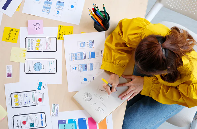
Creating a smooth and engaging user experience while keeping the design visually clean is the heart of every successful website. A good UX/UI design is not just about colors and shapes; it’s about understanding what the user needs, how they behave, and how to guide them without making them think too much. Web designers must follow key principles that balance functionality and beauty. Let’s explore the most important UX/UI principles every web designer should understand, especially those working with diverse audiences like in Dubai.
Keep It Simple
A simple design is easier to use. Avoid clutter, confusing icons, or too many elements on one page. Focus on keeping things clear. Users should be able to find what they are looking for without any confusion. Clean layouts, white space, and readable fonts help users stay focused and reduce frustration, all these are the things that every website designer should know.
Tip: Instead of filling every corner of the screen, leave some areas empty. It helps the user breathe and absorb the information better.
Consistency Builds Trust
Make sure the design feels the same throughout the website. Fonts, buttons, icons, and colors should not change without a reason. Consistency in design makes users feel safe and in control. It also saves time because users don’t have to relearn how your website works.
Example: If the “Buy Now” button is green on one page, don’t make it red on another. This breaks the flow.
Use Clear Visual Hierarchy
Not all information is equally important. Highlight key parts of the page using size, color, or position. This tells users what to look at first. Big titles, bold buttons, and strong colors help users notice important elements quickly.
Practice: Place the most important message at the top or in the center. Use larger fonts or strong colors to make it stand out.
Design for All Devices (Mobile-First)
People use phones, tablets, and desktops. Your website should work perfectly on all of them. Start designing for mobile first and then scale up for larger screens. This approach ensures all users have a good experience, no matter which device they use.
Why it matters: A website that is not mobile-friendly will lose users quickly, especially when people are on the move.
Navigation Should Be Intuitive
Menus, buttons, and links must be easy to find and use. A good navigation system guides users smoothly. Avoid complex structures. Use clear labels and logical page structures.
Good Practice: Use a sticky header, clickable logos to go back home, and breadcrumb navigation when needed.
Accessibility is Essential
Your website must be usable by everyone, including people with disabilities. Follow accessibility guidelines such as using alt text for images, readable fonts, contrast between text and background, and keyboard-friendly design.
Remember: Accessible design improves user experience for all users, not just those with special needs.
Speed Matters
If your website loads slowly, people will leave. Optimize images, reduce scripts, and use fast hosting. Every second counts. Fast websites also get better results in search engines.
Pro Tip: Use tools like Google PageSpeed Insights to test your site’s speed and get suggestions for improvement.
Read Also: How to Present Substance in the Most Ideal Way Imaginable
Content Must Be User-Focused
Write content that solves users’ problems. Speak their language. Use clear headings, bullet points, and short paragraphs. People usually scan websites instead of reading every word.
Important: Focus more on what the user wants to know instead of what you want to say.
Microcopy and UX Writing
Words on buttons, form labels, and messages must be clear and helpful. This is called microcopy. It guides users, sets expectations, and reduces confusion.
Example: Instead of a button that says “Submit,” use “Send Message” or “Book Now” to be more specific.
Emotional Connection
Design can trigger emotions. Use images, colors, and stories that connect with users on a deeper level. Add real testimonials, friendly messages, or warm visuals.
Why: People are more likely to trust and return to websites that feel human and genuine.
Use of White Space
White space (empty space) helps content stand out. It makes pages look neat and easier to read. Don’t be afraid to leave gaps. It gives users room to focus.
Balance: Make sure elements have space between them so nothing feels squeezed.
Provide Feedback
Let users know when something happens. If they click a button, change its color. If there’s an error, show a message. These are called micro-interactions and they make users feel in control.
Also: Use progress bars or loading spinners for actions that take time.
Test With Real Users
Always test your design with real people. Even a few users can reveal what’s confusing or broken. You can do A/B testing or simple interviews to see how people use your design.
Fix: Update your design based on their feedback to make it better.
Plan for Mistakes (Error and Empty States)
Users will make mistakes. Plan for it. Use friendly error messages and helpful tips to guide them. Also, design empty states (like when no search result is found) with useful suggestions.
Tip: Don’t say “Error 404.” Say “Page not found. Try searching again or return home.”
Design Systems Help Consistency
Use a design system with reusable components (like buttons, forms, headers). It saves time and keeps your designs consistent across different parts of the site.
Tools: Figma, Adobe XD, or Sketch can help build your system.
Collaborate With Developers
Designers and developers should work together. When handing over designs, explain how things should behave. Use tools like Figma Inspect, Zeplin, or Adobe to make the handover smoother.
Goal: A good design is useless if it’s not built properly.
Include Local Preferences (Localization)
If your users speak different languages or come from different cultures, adapt the design. Support Arabic (RTL text), use local images or examples, and make sure text fits well when translated.
Value: Localized designs feel more personal and user-friendly.
Use Animations Wisely
Animations can guide users and show that something has changed. Use them to draw attention to key elements or explain actions.
Note: Keep animations smooth and short. Don’t overdo it.
Ethical UX: Avoid Dark Patterns
Never trick users into clicking or buying something. Stay honest. Avoid fake countdowns, confusing checkboxes, or hidden fees.
Respect: Good design respects the user’s choice and builds long-term trust.
Study Analytics and Improve
Use tools like Google Analytics, Hotjar, or Microsoft Clarity to see how users behave. Find where they leave or get stuck. Use this data to improve your design.
Important: Good design is not one-time. It’s always improving.
Final Thoughts
UX/UI design is more than how a website looks. It’s about how users feel while using it. A successful web designer focuses on clarity, speed, emotions, and real user behavior. Whether you are working for an agency in Dubai or freelancing worldwide, these principles will help you create websites that people love to use. Focus on people, not just pixels. That’s where great design begins.