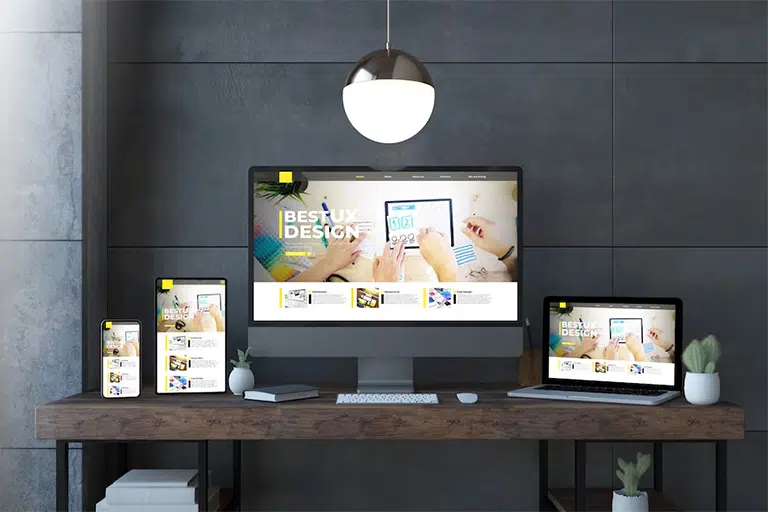
A website is often the first point of contact between a business and its customers. But what happens when that website doesn’t work well on a mobile phone or tablet? Many users will leave instantly. This is where a responsive website plays a major role. A responsive website adjusts automatically to fit the screen size of the device whether it’s a desktop, tablet, or smartphone offering a smooth and comfortable browsing experience to everyone.
Businesses in Dubai and around the UAE are realizing that users visit websites from various screen sizes. People use phones at metro stations, tablets while shopping, and laptops at offices. If a website doesn’t adjust well, it loses attention, traffic, and potential sales. Let’s explore how a responsive website can help, why it matters, and what real benefits it offers.
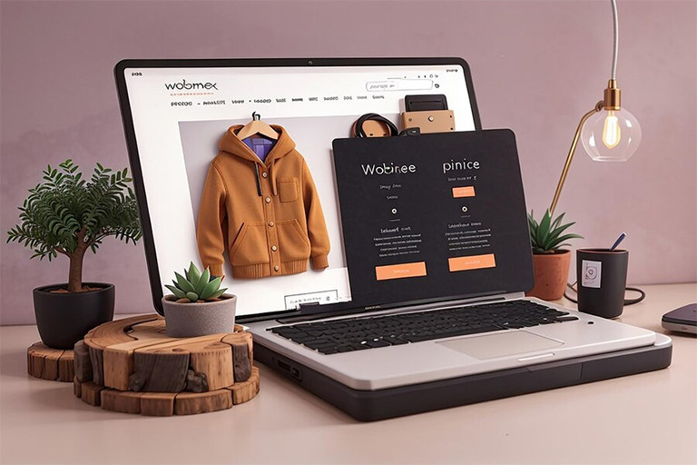
What is a Responsive Website?
A responsive website uses a design style that changes layout, images, and content automatically depending on the screen size. That means your website will look good and work well whether a user is browsing from a small smartphone or a large monitor. Responsive websites use flexible grids and CSS media queries to adapt page elements. Instead of creating separate mobile and desktop websites, one responsive site works everywhere.
Key Benefits of a Responsive Website
1. Reach More Mobile and Tablet Users
Mobile phones are everywhere. In the UAE, around 92% of users access the internet through smartphones. If your website isn’t responsive, you’re missing out on this massive audience. Responsive websites ensure that people visiting from their phones or tablets get the same smooth experience as those on laptops. Buttons are easier to tap, text is readable without zooming, and images fit well on screens. This increases your site traffic and helps users stay longer.
2. Improve Sales and Conversion Rates
Users like simple and easy experiences. If they face problems navigating your website on their phones, they will leave. A responsive site offers smooth flow from browsing to buying. It reduces errors, eliminates unnecessary redirections, and avoids slow loading issues.
For example, an e-commerce site with responsive design can increase product views and reduce cart abandonment. A consistent experience across all devices boosts trust, encouraging people to complete purchases or fill out forms.
3. Boost Your Search Engine Visibility (SEO)
Google ranks websites based on mobile-friendliness. If your website is not responsive, it may fall in search rankings. Responsive websites are easier for Google bots to crawl and index.
Also, having a single responsive website means you avoid duplicate content issues that arise from having separate mobile and desktop versions. This helps you focus all your SEO efforts on one URL. Better rankings mean more visibility, and more visibility brings more business.
Extra Tip: Responsive websites perform better in local searches, especially when users search “near me” on mobile.
4. Better User Experience (UX)
User experience is everything. If your website is hard to use on mobile, it sends a bad message. Responsive design helps:
- Text adjust to screen size
- Buttons become thumb-friendly
- Menus open easily on tap
- Forms become simple to fill
- Images scale properly without breaking
When users feel comfortable, they stay longer, read more, and are more likely to return.
5. Save Money on Development & Maintenance
Before responsive design, businesses had to create different websites for mobile and desktop. This doubled development costs and increased maintenance efforts. Now, with a responsive website, you only manage one website, saving both time and money.
You can use a single CMS like WordPress or Shopify to handle all content updates. No need to worry about syncing changes between two separate sites.
6. Faster Page Loading Across Devices
Page speed is critical. Users leave websites that take more than 3 seconds to load. A responsive website loads faster on all devices when designed properly. Images are resized to match the device, scripts are optimized, and unnecessary code is removed. Google also measures speed using Core Web Vitals such as:
- Largest Contentful Paint (LCP)
- First Input Delay (FID)
- Cumulative Layout Shift (CLS)
A responsive website helps meet these benchmarks and improves overall speed and stability.
7. Easier Tracking and Analytics
When you have one responsive website, it’s easier to analyze user behavior. You don’t have to compare reports between mobile and desktop versions. Tools like Google Analytics and Search Console provide unified data.
This helps in:
- Tracking traffic sources
- Monitoring user journeys
- Identifying bounce points
- Optimizing conversion funnels
It becomes simpler to make decisions based on a complete picture.
8. Prepare for Future Devices
Technology is changing fast. Devices are not limited to phones, tablets, and desktops. Now we have smartwatches, foldable phones, TVs, and even car displays. A responsive website is flexible by design. It can easily adjust to any new screen size in the future without needing a redesign.
9. Enhances Your Brand Image
First impressions matter. A poorly structured mobile site can make your business look outdated. On the other hand, a responsive website gives a professional and modern impression.
Customers associate a well-designed site with quality service. If your site is clean, easy to use, and works well on all devices, users will remember your brand positively.
10. Supports Offline Browsing with HTML5
Responsive websites using modern frameworks like HTML5 allow partial access even when offline. This is useful for users in areas with poor signal or during travel. Content can be stored and displayed without needing constant connectivity.
11. Better Performance on E-commerce Platforms
If you run an online store, responsive design is not optional—it’s a must. Platforms like Shopify, WooCommerce, and Magento all support responsive themes. A mobile-friendly interface makes product searches, filtering, and checkout easier.
Users often browse on mobile and make purchases later on desktops. A seamless experience across both boosts your brand reliability.
12. Helps in Social Media Traffic Conversion
Most social media users open shared links on their phones. If your landing page isn’t responsive, visitors will leave within seconds. Responsive pages ensure that shared blog posts, product pages, or lead forms load quickly and properly from platforms like:
- TikTok
Social media campaigns are more successful when paired with responsive landing pages.
13. Risk of Not Having a Responsive Website
It’s important to understand what you might lose without a responsive website:
- Poor mobile experience
- Drop in Google search rankings
- Increased bounce rates
- Low conversion and sales
- Negative brand impression
- Wasted ad spend on mobile clicks
By not going responsive, you’re pushing away a large part of your audience.
14. Good for Digital Marketing Campaigns
If you run PPC or email campaigns, the performance of your landing page directly affects your ROI. Responsive websites reduce bounce rates and improve ad quality scores, especially for Google Ads. Similarly, email newsletters viewed on phones are more effective when they link to responsive pages that users can easily interact with.
15. Fits Well with CMS and Builders
Whether you use WordPress, Wix, Webflow, or custom code, almost all modern tools support responsive design. It also means your marketing or support team can update content easily without breaking layouts.
Real Example: Company Boosted Leads by 40%
One Dubai-based real estate agency saw a 40% increase in leads after shifting to a responsive website. Before that, most mobile users bounced off the homepage due to poor usability. After redesigning responsively, they saw better rankings, faster speed, and more user engagement. This example shows the power of mobile optimization.
How to Make Your Website Responsive
You don’t always need to build a new site from scratch. Here are steps to go responsive:
- Choose a mobile-friendly theme or template
- Use CSS media queries to define screen rules
- Optimize images for speed and flexibility
- Use scalable fonts and tap-friendly buttons
- Test using tools like Google Mobile-Friendly Test
- Track improvements in Google Analytics
If you don’t have a developer, many agencies in Dubai can help you redesign your website for mobile users.
Conclusion
A responsive website is no longer an option. It’s a basic requirement for success. As users in the UAE continue to rely on phones and tablets, a responsive website ensures that you’re ready for them anytime, anywhere.
Whether your goal is to grow traffic, boost SEO, or increase sales, mobile responsiveness helps you achieve all three. It improves user satisfaction, reduces bounce rate, and saves development costs. In short, it’s the smartest and most future-proof approach to web design. If your current website isn’t responsive, it’s time to take action. Don’t let your competitors grab your customers give them a better experience before they leave.