Your website is often the first interaction customers have with your business. A well-designed website can help you gain trust, keep users engaged, and even convert visitors into buyers. But if your web design is poor, slow, or confusing, people may leave quickly and never come back. Below are 10 essential web design tips, along with additional improvements based on real-world needs, user behavior, and current trends to help you build a modern, user-friendly, and high-converting website.
Start With a Clear Plan
Before jumping into design tools or templates, take time to plan your website structure. Think about your goals: Do you want to generate leads, make sales, or provide information?
Break down your plan into these key steps:
- Identify your target audience
- List your most important pages (Homepage, Services, Contact, etc.)
- Decide what action you want users to take (fill form, call, buy)
When you create a layout or wireframe, it becomes easier for the entire team—designer, developer, and content writer—to stay on the same path.
Extra Tip: Use tools like Figma, Adobe XD, or even pen and paper to map user flow before starting development.
Use Real Images Instead of Stock Photos
Many websites rely heavily on stock images, but this can make your site feel cold and generic. People trust real visuals more. If you’re a business in Dubai, for example, showcase photos of your actual team, office, or products.
Why this matters:
- Builds authenticity
- Increases user trust
- Makes your brand more personal
If you need visuals but don’t have a budget, you can take high-resolution photos using your mobile phone. Just make sure the lighting and background are clean.
Keep Language Simple and Clear
Avoid confusing, technical words or too much marketing fluff. Visitors should understand what your business offers in just a few seconds.
Replace these:
- “Cutting-edge digital transformation solutions” ➜ “We build powerful business websites”
- “Synergize your workflow ecosystem” ➜ “We help you work smarter and faster”
Be clear, short, and specific. This helps all types of users—including those with lower reading levels or non-native English speakers.
Add Social Share and Follow Buttons
If users enjoy your content or services, make it easy for them to share it. Include social media buttons that:
- Let users share your blog posts or products
- Allow users to follow your pages directly from the website
Place these buttons:
- At the top or bottom of blog pages
- On product pages in Ecommerce website
- On the footer of your site
Just be careful not to overload every page with icons, especially if they slow down the site.
Use Strong Calls-to-Action (CTAs)
Many websites miss the chance to turn visitors into leads because their CTA is weak or hidden. A good CTA should tell users exactly what to do, like:
- “Book a Free Demo”
- “Get a Quick Quote”
- “Start Your Free Trial”
CTA Placement Tips:
- Use contrasting button colors
- Put at least one CTA above the fold
- Repeat CTAs at the end of long pages
Also, test different CTA texts and placements to see what gets the best response.
Use the Right Images for the Right Audience
Your visuals should match the tone and expectations of your visitors.
For example:
- If your audience is corporate, use clean, professional imagery
- If your brand is creative, use artistic or playful visuals
- If you serve a local market (like Dubai), use images that show local culture or environment
Always make sure your images load quickly and are optimized for both desktop and mobile devices.
Create Easy and Logical Navigation
Your visitors should be able to find what they want in 2–3 clicks. Confusing navigation leads to high bounce rates and poor conversions.
Tips to improve navigation:
- Use a sticky top menu
- Add breadcrumbs on inner pages
- Group similar items under dropdowns (e.g., Services, Products)
Also, include a search bar if your website has a lot of content.
Use Scroll-Friendly Homepages
Scrolling is no longer bad design. In fact, many users now expect to scroll through information instead of clicking through multiple pages.
Make sure your homepage tells your brand story section by section:
- Introduction
- Services/Products
- Testimonials or client logos
- CTA section
- Footer with contact details
Use white space to separate sections, making your design look clean and easy on the eyes.
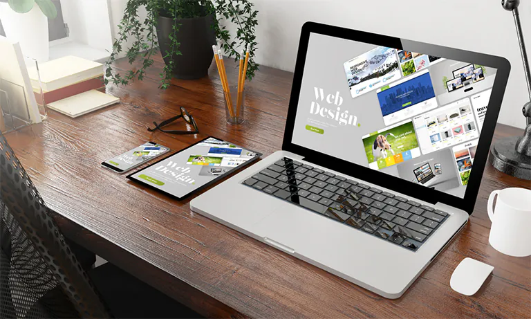
Design for Mobile First
Over 60% of users visit websites from mobile phones. A mobile-friendly website isn’t optional anymore—it’s necessary.
Make sure your website:
- Uses responsive layout
- Has buttons big enough for fingers
- Loads quickly on mobile data
Test your site on different screen sizes using browser tools or services like BrowserStack. Don’t forget to check the mobile menu, images, and form inputs.
Read Also: Tips For Finding the Top Web Design Companies in Dubai
SEO Should Be Part of Design
Search engines don’t just look at keywords—they also care about how your website is built.
SEO design tips:
- Use proper heading tags (H1, H2, H3)
- Optimize image sizes and add alt text
- Write clean, readable URLs
- Make sure your pages load in under 3 seconds
- Install SSL (HTTPS)
Also, add internal links and a proper sitemap to help search engines crawl your site better.
Improve Page Loading Speed
Speed affects everything—user experience, bounce rate, and SEO. Slow websites push people away.
Ways to improve speed:
- Compress images using tools like TinyPNG
- Enable caching and use CDN (Content Delivery Network)
- Minimize the use of heavy scripts or plugins
Run a speed test using Google PageSpeed Insights or GTMetrix and fix all red flags.
Make Your Website Accessible
Design with everyone in mind—including people with disabilities. Accessibility isn’t only a moral responsibility, but also helps you reach a wider audience.
Accessibility improvements:
- Use proper contrast between text and background
- Make sure all images have descriptive alt text
- Use readable fonts and sizes
- Make sure the site can be navigated using a keyboard
Following WCAG (Web Content Accessibility Guidelines) helps ensure no user is left behind.
Pay Attention to Typography
Font style, size, and spacing affect how easy your content is to read.
Tips:
- Use a clean font like Roboto, Open Sans, or Lato
- Keep font size between 16–18px for body text
- Maintain proper line height (1.4–1.6)
Avoid using too many different fonts, which can make your design look messy.
Use Analytics to Improve UX
Don’t rely on guesswork. Use analytics to see how users interact with your website.
Helpful tools:
- Google Analytics (track behavior, bounce rate, traffic source)
- Hotjar or Microsoft Clarity (see heatmaps and user recordings)
- A/B testing tools like Google Optimize
Use these insights to improve layout, CTA placement, or even content length.
Keep Updating and Testing
Web design isn’t a one-time job. You need to keep testing, improving, and staying updated with new design patterns.
Test regularly:
- Try new CTA button colors or text
- Experiment with homepage layout
- Improve low-performing landing pages
Ask for feedback from real users or run usability testing sessions.
Final Thoughts
Web design is all about how users feel when they land on your website. Good visuals, fast loading, clean navigation, and strong messaging work together to create a better experience. Even small changes like adding a clear CTA or improving page speed can lead to big improvements in performance.
If your goal is to build a better website in 2026, following these essential and improved tips will keep your site modern, functional, and user-friendly.