Website design is always changing. What looked modern two years ago can now look outdated. As technology grows, users expect fast, easy, and beautiful websites. If your site is hard to use or looks old, people might leave without even reading what you offer. So, it’s time to refresh your knowledge with the latest website design trends that are going to influence the upcoming year.
Let’s explore all the essential trends—some you already know, and many that are rising fast.
Fast Loading Speed is Still the King
People hate waiting. If your website takes more than 3 seconds to load, many users will leave. Search engines also give better rankings to fast websites. This means that performance is not just for users—it’s also important for visibility.
Here are a few ways to improve speed:
- Use optimized images (prefer WebP format)
- Minimize the use of large libraries
- Use a reliable hosting service
- Enable caching and CDN support
Fast websites give better user experience and reduce bounce rates. Make speed your top priority.
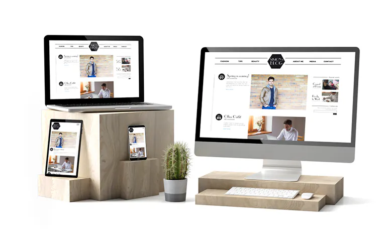
Mobile-First and Thumb-Friendly Design
Most people browse using mobile phones. That’s why mobile-first design is no longer a trend—it’s a requirement. Layouts should be clean, buttons should be big enough to tap easily, and the navigation should be simple.
Designers must also consider the “thumb zone,” which means placing important elements where thumbs can reach easily on mobile screens. Mobile-friendly design improves conversions and keeps visitors longer on your site.
Parallax and Captivating Scrolling
Scrolling effects are more than just fun—they create an emotional connection. Parallax scrolling gives depth to the website by making background and foreground elements move at different speeds.
Use it in moderation. It works best on landing pages or hero sections to grab user attention.
Dynamic Cursor Effects
The standard arrow cursor is being replaced with custom animations and interactive icons. These changes add a playful element and invite users to explore more.
Examples include:
- Changing cursor shape when hovering over buttons
- Animated rings or trails
- Expanding icons during clicks
Such small features enhance the user’s journey and increase time spent on the site.
Lazy Loading and Smart Content Delivery
Websites today contain a lot of media: images, videos, and scripts. Instead of loading everything at once, lazy loading helps load content as users scroll.
This not only improves speed but also saves server resources. Most browsers now support native lazy loading, making it easier to implement.
Personalization Through Geolocation and Browser Behavior
Websites that understand user preferences and location provide better experiences. Based on user behavior, browsing history, or even browser language, content can be personalized.
For example:
- Showing local offers
- Displaying content in the local language
- Remembering preferences from past visits
Personalized sites improve engagement and increase the chances of conversion.
Voice Search Compatibility
More users are speaking to their devices rather than typing. While voice search is popular in mobile apps and smart speakers, websites are now being optimized for voice interaction.
What to consider:
- Use clear headings and questions
- Add structured data to your content
- Focus on natural language keywords
Sites that work well with voice commands will attract more mobile users and make navigation easier.
CSS Grid and Asymmetrical Layouts
Designers are now breaking away from the traditional grid systems. The use of CSS Grid allows for creative, yet well-structured layouts.
Asymmetry makes a site feel modern and artistic, without losing clarity. This kind of layout works great for creative portfolios, blogs, and brand-focused landing pages.
Progressive Lead Forms
Instead of asking users to fill long forms, modern websites now use smart progressive forms. These forms adjust based on the data already known.
First-time visitors may only be asked for a name and email. If they return or engage more, the form slowly collects more details like phone number, company name, or budget.
This approach avoids overwhelming users and increases form submissions.
Micro-Interactions That Add Delight
Micro-interactions are small animations or responses that guide users while they interact with the site. For example:
- A heart animation when liking a post
- A button that changes color when clicked
- Tooltip appearing on hover
They make the site feel alive. These small touches help build trust and encourage users to take action.
Minimalist and Brutalist Design Styles
Minimalist designs use lots of white space, clean lines, and focus on one message at a time. It’s simple, elegant, and efficient.
On the other hand, brutalist designs are raw and bold. They break traditional rules, using sharp colors, large fonts, and unexpected layouts. This style isn’t for everyone, but it makes a strong impression.
Choose based on your brand personality.
Lottie Animations and Motion UI
Lottie animations are lightweight, scalable animations that add life to your interface. These animations load fast, work across devices, and make your site more engaging without hurting performance.
Pair them with Motion UI—an animation library that helps add smooth transitions and interactions across elements.
Dark Mode and Accessibility
Dark mode reduces eye strain and extends battery life on mobile. Many users now expect it as a default or optional feature.
Alongside dark mode, color accessibility is crucial. Ensure your contrast ratios follow WCAG standards. Design for all users, including those with vision issues.
Visual Storytelling and Scrollytelling
Websites are not just digital brochures anymore. They are tools to tell your brand story. Use a mix of visuals, animations, and scroll-triggered content to guide users through a narrative.
This technique works especially well for:
- Product launches
- Campaigns
- Educational content
It makes your content memorable and builds emotional connections.
AI-Enhanced Design Tools
AI is becoming part of the web design workflow. Platforms like Figma and Adobe XD now include features like smart layout suggestions, content auto-fill, and image editing through AI.
Benefits include:
- Faster prototyping
- Intelligent design suggestions
- Auto image cropping and alignment
AI will not replace designers but make their work more efficient.
Ethical Design and Privacy UI
With data privacy becoming more important, websites must be clear and ethical in how they handle user data. Transparent cookie banners, easy opt-in forms, and clear privacy policies are essential.
Users are more likely to trust sites that respect their data.
Sustainable Web Design
Eco-conscious design is on the rise. Web Designers are focusing on:
- Reducing heavy media usage
- Using efficient code
- Green hosting providers
Sustainable websites load faster, consume less energy, and help brands show their commitment to the environment.
Final Thoughts
Web design is moving quickly. To stay ahead, it’s important to balance visual appeal with functionality and user needs. The future of web design is about making experiences smoother, smarter, and more personal.
Whether you’re building a portfolio, an eCommerce platform, or a business site, these trends help you stand out and stay relevant.
Stay updated, stay creative, and keep testing what works best for your audience.


