Building a website or Web Design that keeps visitors engaged and happy isn’t rocket science. It’s all about making things easy to find, fast to load, and simple to use. Here are 10 Key Elements of User-Oriented Website Design to work well for your users.
Clear Navigation
If your visitors can’t find what they’re looking for in a few clicks, they’ll likely leave. Clear, simple navigation helps guide them to the right place without frustration.
Tips for Clear Navigation:
- Keep it Simple: Don’t overload your menus with too many options. Group related pages together.
- Limit Clicks: Make sure visitors can reach key pages within three clicks.
- Use Obvious Labels: Call your pages what they are—no need for fancy or vague names.
Example: On a restaurant’s website, a visitor shouldn’t have to hunt for the menu or the reservation page. Those should be right at the top or in the main menu where people expect them.
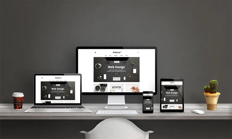
Mobile Responsiveness
These days, most people visit websites on their phones. If your site doesn’t look good or work well on smaller screens, you’re losing visitors.
Tips for Mobile Responsiveness:
- Flexible Design: Make sure your site adjusts to different screen sizes smoothly.
- Big, Touchable Buttons: People need to be able to tap buttons easily on their phones.
- Test on Devices: Always test your site on a phone, tablet, and desktop before going live.
Example: If you run an online shop, your products should be easy to browse and buy on mobile. Otherwise, people will just leave and buy from somewhere else.
Fast Loading Times
People are impatient. If your website takes too long to load, visitors will click away. Speed matters.
Tips to Speed Up Your Site:
- Optimize Images: Use smaller file sizes without losing too much quality.
- Clean Code: Get rid of anything in your code that slows things down.
- Use Caching: Save parts of your website on visitors’ devices so it loads faster next time.
Example: If you’re a photographer, having high-quality images is important, but they still need to load quickly. Compress them to speed things up without sacrificing too much detail.
Simple and Clean Design
A cluttered website confuses visitors. A clean design lets people focus on the content or products without distractions.
Tips for a Clean Design:
- Use White Space: Don’t cram everything together. Give your content room to breathe.
- Limit Colors and Fonts: Stick to a few colors and fonts to keep things looking sharp.
- Skip the Pop-Ups: Too many pop-ups will just annoy your visitors.
Example: Apple’s website is a great example. It’s clean, simple, and puts the focus on the products, not unnecessary distractions.
Easy-to-Read Text
Nobody wants to struggle through small, crowded, or hard-to-read text. Keep it simple and readable.
Tips for Better Typography:
- Pick Simple Fonts: Stick to fonts that are easy on the eyes like Arial or Helvetica.
- Text Size Matters: Make sure your text is large enough to read, at least 16px.
- Contrast: Ensure there’s a strong difference between your text and background color.
Example: News websites like CNN use big, clear fonts so users can skim articles without straining their eyes.
Clear Call-to-Action (CTA) Buttons
CTA buttons should guide your visitors to take the next step—whether that’s buying something, signing up, or downloading a resource. They need to stand out and be clear.
Tips for Effective CTAs:
- Use Strong Action Words: Say things like “Buy Now” or “Sign Up,” so people know what to do.
- Make Them Visible: Use bright colors that stand out from the rest of your page.
- Put Them in Logical Places: After blog posts, product descriptions, or in your header—wherever it makes sense.
Example: If you run a software company, a big button that says “Start Your Free Trial” right at the top of the homepage will get more clicks than one buried at the bottom.
Trust Signals and Security
If your site handles sensitive info, like credit card details, visitors need to trust you. Showing security measures and user reviews builds that trust.
Tips for Building Trust:
- Use HTTPS: Ensure your site is secure (you can tell by the lock icon in the address bar).
- Show Reviews: Real customer feedback adds credibility.
- Security Badges: Use badges from known companies like Norton or PayPal to show you take security seriously.
Example: Amazon uses SSL encryption (the padlock icon) and displays reviews for every product, which makes customers feel safer about shopping there.
Engaging Content
Your content needs to be valuable and interesting. Whether it’s blog posts, product descriptions, or tutorials, make sure your content keeps users engaged.
Tips for Engaging Content:
- Update Regularly: Keep your content fresh with regular updates.
- Be Relatable: Write in a way that your audience understands and connects with.
- Use Visuals: Images, infographics, and videos help break up text and keep visitors interested.
Example: A travel blog with updated tips and beautiful photos of destinations keeps readers coming back for more advice and inspiration.
Accessibility for Everyone
A good website works for everyone, including people with disabilities. Ensuring your site is accessible means more people can use it, and it’s often required by law.
Tips for Accessibility:
- Use Alt Text for Images: This helps visually impaired users understand your images through screen readers.
- Keyboard Navigation: Make sure users can navigate your site using just a keyboard.
- Good Color Contrast: Choose colors that are easy to read for users with visual impairments.
Example: Many government websites make sure to meet accessibility standards so all users, regardless of ability, can access important information.
Analytics and Feedback
Understanding how visitors interact with your website helps you improve. Tracking tools and feedback forms give you insights into what works and what doesn’t.
Tips for Tracking and Feedback:
- Use Analytics: Tools like Google Analytics help you track how visitors behave on your site.
- Heatmaps: These show where people click the most on each page.
- Ask for Feedback: Provide a simple way for users to give feedback on their experience.
Example: An online education platform might use analytics to see which courses are popular and which ones users struggle with, then make adjustments accordingly.
Wrapping Up
Building a User-friendly Website Design doesn’t have to be complicated. By focusing on these key elements—like clear navigation, fast loading times, and accessible design—you’ll create a site that visitors enjoy using. In turn, they’ll stick around longer and are more likely to engage with your content, products, or services.