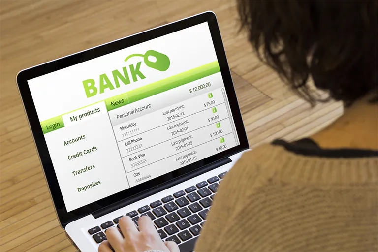
The banking world is changing quickly. People want easier ways to handle their money, and the internet plays a big role in that. Now, most users check a bank’s website before they decide to trust them. If the site is slow, confusing, or doesn’t feel safe, people will leave immediately.
A good bank website must:
- Be mobile-friendly
- Look modern and trustworthy
- Offer clear paths to key services
- Keep information safe
- Help people make smart financial decisions
Let’s explore what makes a bank website great and learn from 10 top examples around the world. We’ll also look at important website features and trends that help banks build trust with customers.
What Makes a Great Bank Website?
Before jumping to samples, it’s helpful to know what actually makes a bank website work well. Here are some key design and functional elements:
- Simplicity: Clean layouts help people find what they need fast. No clutter or long text.
- Fast Load Times: Sites should load in under 3 seconds. Speed builds trust.
- Clear CTAs (Call to Actions): Buttons like “Open Account,” “Login,” and “Apply Now” must be easy to find.
- Strong Visual Design: Professional graphics, icons, and meaningful visuals help tell the brand story.
- Mobile Responsiveness: Most users use phones. The layout must adjust to any screen.
- Accessibility: The site should work with screen readers and follow contrast standards.
- Personalization: Some banks offer content or product suggestions based on customer type.
- Security Features: SSL, trust badges, 2FA, and secure login help customers feel protected.
10 Top Samples of Bank Website Design
Each of the following examples offers lessons in design, structure, or customer experience:
Wells Fargo
Website: https://www.wellsfargo.com/
Wells Fargo is a major U.S. bank known for its user-focused website. The homepage greets users with large navigation buttons and bold visuals. The site clearly separates options for personal, business, and commercial banking.
What Works Well:
- “Small Business” section is visible from the homepage.
- Helpful tools like savings calculators and planning guides.
- Big, readable fonts and simple colors.
Notable Feature: Mobile app promotion with QR scan directly on the homepage.
Improvement Suggestion: Add more interactive customer support options.
KeyBank
Website: https://www.key.com/
KeyBank has a welcoming feel with its “Come On In” headline and interactive layout. The site uses a red and white theme with friendly graphics.
What Works Well:
- Personalized financial suggestions
- Customer videos explaining product benefits
- Smooth scrolling animation
Notable Feature: Transparent login and service section above the fold.
Improvement Suggestion: Reduce visual clutter on mobile.
People’s United Bank
Website: https://www.peoples.com/
Their website uses a very neat and white-dominant design. Red call-to-action buttons guide users toward core banking services.
What Works Well:
- No visual overload
- Easy-to-read info blocks
- Quick access to tools and calculators
Notable Feature: Colored info blocks to highlight key services
Improvement Suggestion: Add visual content like icon-based menus.
Bank of Melbourne
Website: https://www.bankofmelbourne.com.au/
This Australian bank keeps things minimal. They use a ribbon carousel to show top products like home loans and credit cards.
What Works Well:
- Balanced spacing and color use
- Financial tools for customers visible immediately
Notable Feature: Interest rate chart displayed on homepage footer
Improvement Suggestion: Include more visuals of real customers for trust-building.
Simple (USA)
(Simple Bank was acquired by BBVA, now part of PNC Bank)
It had a clear mission: make banking stress-free. Its website reflected this with ultra-minimalist design, open spaces, and clear text.
What Worked Well:
- Clear branding with calm colors
- Financial education in plain English
Notable Feature: Guided tours for beginners in online banking
Improvement Suggestion: Needed more visual appeal for older audiences.
ICICI Bank (India)
Website: https://www.icicibank.com/
ICICI uses bright visuals and interactive tools. The homepage is filled with service blocks but still easy to use.
What Works Well:
- iPlay Digital Banking and WhatsApp Banking
- Quick access to customer service via chatbot AskiPal
Notable Feature: Video tours on homepage
Improvement Suggestion: Slight overload of choices can overwhelm users.
BBVA USA
Website: https://www.bbvausa.com/
BBVA’s website is neatly divided into sections for each type of user: individuals, businesses, etc.
What Works Well:
- Logical content blocks
- Transparent product info
- Quick loan application process
Notable Feature: Navigation based on user profile (student, business, etc.)
Improvement Suggestion: Add live chat or virtual assistant.
P&N Bank (Australia)
Website: https://www.pnbank.com.au/
Their homepage has a modern visual layout. With sidebar access to rates and login, users don’t need to scroll much.
What Works Well:
- Sidebar with floating menu
- Consistent color scheme (red and white)
Notable Feature: Custom background for seasonal messages
Improvement Suggestion: Add quick financial tips or blog insights.
Heritage Bank Limited
Website: https://www.heritage.com.au/
Heritage Bank builds trust by displaying awards and key product rates upfront.
What Works Well:
- Simple text with wide spacing
- Buttons lead to direct actions
Notable Feature: Award badges and trust elements on homepage
Improvement Suggestion: Add more user visuals or testimonials.
Zenith Bank
Website: https://www.zenithbank.com/
Zenith Bank is known for its strong visual identity. Custom animations and background visuals help it stand out.
What Works Well:
- Bold professional color use (red, grey)
- Global access with region selectors
Notable Feature: Smooth animation and language options
Improvement Suggestion: Add regional personalization based on country.
Comparison Table of Features
| Bank Name | Mobile Friendly | Chatbot | Personalization | Trust Elements | Speed Rating |
|---|---|---|---|---|---|
| Wells Fargo | Yes | No | Medium | High | Fast |
| KeyBank | Yes | No | High | Medium | Fast |
| People’s Bank | Yes | No | Low | Medium | Fast |
| Bank of Melbourne | Yes | No | Medium | Medium | Very Fast |
| Simple | Yes | No | High | Medium | Fast |
| ICICI Bank | Yes | Yes | High | High | Medium |
| BBVA USA | Yes | No | High | Medium | Fast |
| P&N Bank | Yes | No | Medium | Medium | Fast |
| Heritage Bank | Yes | No | Low | High | Fast |
| Zenith Bank | Yes | No | Medium | High | Medium |
Latest Trends in Bank Website Design
- Voice Search Ready Sites for mobile users
- AI Chatbots to guide customers
- Dark Mode Options for visual comfort
- Interactive Education Tools (like EMI calculators)
- Video Banking Support for remote interaction
Final Thoughts
Bank website design is more than just colors and buttons. It’s about trust, ease, and clarity. Whether it’s a small community bank or an international brand, the goal remains the same: make customers feel confident and help them take smart actions. If you are a bank or financial institution planning to improve your digital experience, these examples offer practical inspiration.
And if you’re ready to build a powerful banking site, RedSpider Web Design can help you make it secure, fast, and attractive.