Getting more visitors on your website is a good start, but what truly matters is converting them into real customers. That’s where conversion rates play a powerful role. It’s not about doing a big redesign Web or spending a lot of money. Small improvements and clear strategies can help you turn casual visitors into paying customers or loyal subscribers.
Let’s explore the top ways to improve your website conversion rates — with a focus on practical changes, user behavior, and emotional connection. These are the things that work because they are based on how real people use websites.
Use a Targeted Headline That Speaks to the Visitor
The first thing people see is your headline. If it doesn’t grab their attention, they leave — simple as that. A strong headline clearly tells the user what the page is about and what they will get.
Use words that show benefits. For example:
- “Start Saving Time with This Simple Tool”
- “Get Rid of Unwanted Subscriptions in Minutes”
Make it relevant to your service or product. Avoid boring or generic headlines. Use power words like “how to,” “free,” “save,” “quick,” or “trusted.”
💡 Pro Tip: Try different versions of your headline through A/B testing to see which one gives better results.
Read Also: Benefits of Getting a Bespoke Website Design
Keep Your Lead Capture Forms Simple and Clear
If your form has too many fields, visitors feel tired and leave. Keep only what you truly need — maybe just name and email. You can ask for more details later.
Also, give a reason to fill the form. Instead of just “Subscribe,” say:
- “Get a Free eBook Instantly”
- “Join 5,000+ Smart Business Owners”
Forms should work smoothly on mobile, and buttons should be big and easy to click.
Add Effective Call-To-Actions (CTAs)
A CTA is the button or link that tells users what to do next — like “Buy Now,” “Sign Up,” or “Get Started.” But the words matter.
Try making your CTA benefit-driven:
- ❌ Don’t say: “Submit”
- ✅ Say: “Get My Free Demo”
Put your CTAs in visible places — like top banners, at the end of a section, or near the offer. Use color contrast so the CTA stands out. But don’t overdo it. Too many CTAs can confuse visitors.
Improve Page Loading Speed
No one likes a slow website. If your page takes more than 3 seconds to load, you’re losing visitors.
To fix this:
- Compress images
- Use fast hosting
- Minimize code and scripts
- Avoid unnecessary plugins
Use tools like Google PageSpeed Insights or GTmetrix to check speed and follow their suggestions. A fast and Bespoke Website Design means better user experience, which leads to more conversions.
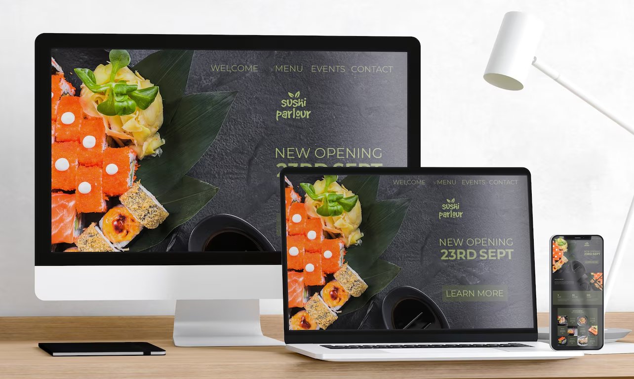
Use a Mobile-Friendly, Clean Website Design
Most people today visit websites on their phones. If your site doesn’t look or work well on mobile, they will leave. A responsive design automatically adjusts for mobile, tablet, or desktop.
Things to ensure:
- Text is readable without zooming
- Buttons are large and easy to tap
- No horizontal scrolling
- Menus are easy to access
Test your site on different screen sizes. A mobile-friendly site builds trust and keeps users engaged longer.
Guide Users with Clear Navigation
If people can’t find what they need on your website, they won’t stay long. Simple and clear navigation is important. Use menu categories like:
- Home
- Services
- Pricing
- Contact
Use a search bar on big sites. Add breadcrumb links on deeper pages. Group content smartly so people feel guided. Confusion leads to drop-offs, so make it easy to browse.
Add Trust Signals (Reviews, Badges, Security Seals)
Visitors are careful before buying. Build trust by showing:
- Verified customer reviews
- Ratings from Google or Trustpilot
- Security badges like SSL, McAfee, or VeriSign
- “As Seen On” media logos
These signals reduce fear and build confidence. Real testimonials with names and photos work even better. Social proof is one of the strongest motivators.
Use Live Chat to Answer Questions Instantly
Some visitors are ready to buy, but they just have a small doubt or question. If they can’t get a quick answer, they leave.
A live chat feature helps solve that. You can use tools like:
- Tawk.to
- LiveChat
- Drift
- WhatsApp integration
Set it to trigger after 10 seconds, or when the user shows exit intent. Even an automated message like “Need help?” can encourage a chat.
Offer Free Shipping or Limited-Time Deals
Everyone loves a good deal. Adding free shipping, bonus items, or discounts for a short time can push visitors to act faster.
Use banners to show offers like:
- “Free Shipping on All Orders Above AED 150”
- “Limited Time – 20% Off This Week”
Countdown timers increase urgency. Combine this with strong CTAs to boost results.
Create a Visual Experience (Videos, Icons, Graphics)
Words are good — but visuals are better. Short videos explaining how your product works or what your service does can improve trust and reduce bounce rate.
Other ideas:
- Use icons to break down services
- Infographics to show data
- Before/after images (great for design or beauty businesses)
A clean, visual layout keeps users scrolling, clicking, and converting.
Use Exit-Intent Popups to Catch Leaving Visitors
When a visitor moves their mouse to close the window, an exit-intent popup can appear. This popup offers a final message to stop them from leaving.
Ideas for exit popups:
- “Wait! Grab a 10% Discount Before You Go”
- “Sign Up Now and Get Free Templates”
Use these sparingly and make them helpful, not annoying.
Guide User Journey from Entry to Checkout
Map out the exact steps a user takes from landing to buying. Are there too many clicks? Are users getting lost? Track this using tools like Hotjar or Microsoft Clarity.
Fix roadblocks by:
- Reducing form steps
- Removing distractions from checkout pages
- Adding progress bars
The easier the path, the higher the chance they’ll complete the action.
Add A/B Testing to Improve Performance
Not sure what works best — red button or green? Long or short form? Run A/B tests using tools like:
- Google Optimize
- VWO
- Optimizely
Change just one thing at a time. Measure which version gets more clicks or conversions. Keep improving based on results.
Simplify Content and Use Emotional Triggers
Use simple words. Be direct. Avoid corporate or robotic language. And tap into emotions.
Emotional triggers include:
- Fear of missing out (FOMO)
- Hope
- Relief
- Belonging
- Trust
Instead of saying “Sign up for our newsletter,” say “Be the first to know about secret offers.” That sounds more exciting and valuable.
Measure Everything with Analytics
You can’t improve what you don’t track. Use:
- Google Analytics for behavior tracking
- Google Tag Manager for event tracking
- Hotjar for heatmaps and recordings
Track:
- Where people drop off
- What pages convert best
- How users scroll and click
Use this info to adjust content, fix broken steps, and improve flow.
Conclusion
Improving your website’s conversion rate isn’t about guessing. It’s about understanding what your visitors need and giving them a smooth, trusted, and helpful experience with effective rules of Web Designing.
Start with your headlines. Simplify your forms. Add trust signals. Test your CTAs. Speed up your site. And most importantly — make it easy for users to take action.
The changes may seem small, but when you apply them together, the results grow fast. A few percent more in conversion can mean a big jump in leads or sales over time. Every Business should make better your website to help increase Sales.
If you’re serious about making your website work better for your business, these steps are where you begin.